Choosing a paint color for your kitchen
If you’ve decided to renovate your kitchen, choosing a paint color is likely a decision you’ll soon have to face.
A simple recommendation would be to decide on a color that works with the countertop design you’ve chosen.
Often, that’s easier said than done. Luckily, Cambria has suggested color pairings for various countertop designs they offer.
With whites and greys being a huge design trend in homes, we’ve listed a few of our favorite neutral Cambria designs with recommended complimentary paint colors.
Get inspired with these fantastic designs paired with some lovely paint color options.
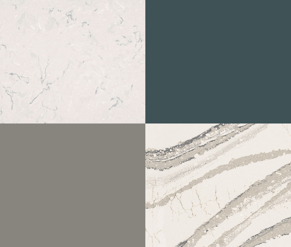
Swanbridge – Cambria Marble Collection, paired with Narragansett Green by Benjamin Moore
Choose a bold colour for your kitchen that pairs well with a bright and airy countertop.
Brittanicca – Cambria Marble Collection, paired with Chelsea Gray by Benjamin Moore
This warm gray is a great way to bring out the fantastic veining throughout Brittanicca.
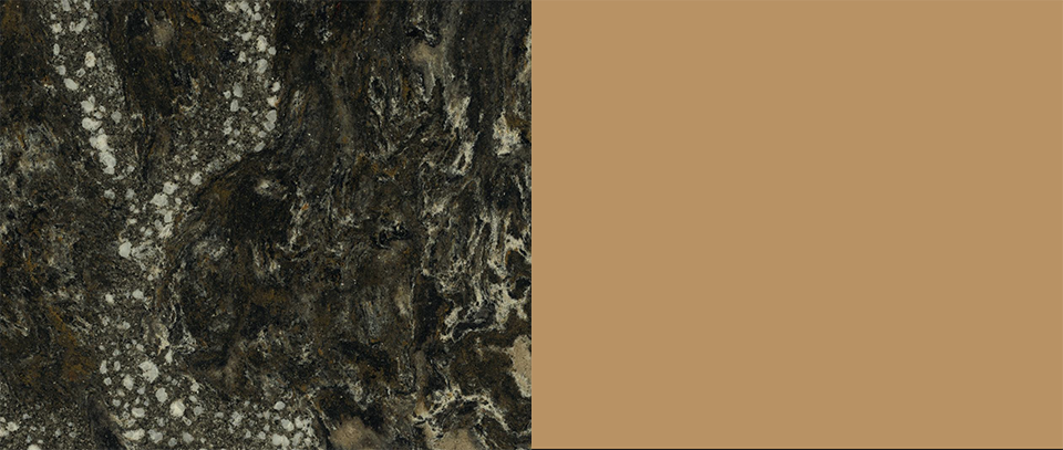
Roxwell – Cambria Oceanic Collection, paired with Horizon by Benjamin Moore
With a bold design like Roxwell, choosing a light a subtle wall color will allow your countertop to shine.
Carrick – Cambria Marble Collection, paired with Hale Navy by Benjamin Moore
The cool grays of Carrick pairs perfectly with navy or other cool tones.
Choosing a paint color for your kitchen – pt.2
You’re in the midst of renovating your kitchen, you’ve picked out your cabinets and countertops, now it’s time to decide on a paint color.
What you may think is the easiest decision to make, often isn’t easy at all. If you’re having trouble deciding on which color is right for you, our recommendation would be to choose one that compliments the countertop design you’ve chosen.
We have listed a few of Cambria’s recommended color choices with some popular warm toned quartz designs.
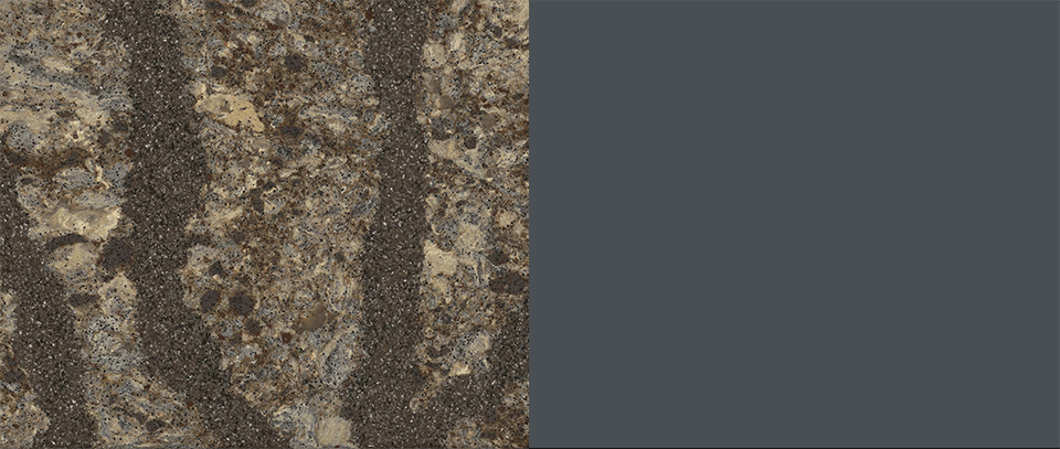
This understated blue-grey is a great way to help bring out the cool grey tones within this quartz design.
Pairing this warm rouge with the simplicity of Devon is a great way to bring some color into your home.
This warm gold helps bring out the hidden warm tones in this beautiful coastal design.
Choosing a darker tone from the veining in Oakmoor really allows for this light quartz design stand out.
Hopefully these beautiful designs and lovely Benjamin Moore paint colors will help to inspire you.
